Free support 24/7
Free support 24/7

We delve into the psychology of conversion rate optimization (CRO). We explore how restructuring the storefront and simplifying the checkout process ensures a seamless and straightforward user journey. We also examine how reducing the technical and psychological barriers between the customer and the purchase button transforms your store from a mere "image gallery" into a nonstop "sales machine."
1. The "One-Click" Philosophy: Bridging the Gap Between Desire and Acquisition
At "Sahil," we consider every extra click a "tax" paid by the customer in terms of time and effort. Designing a successful customer journey begins with placing a "Buy Now" button prominently and clearly on every screen. The goal is to bypass the "Add to Cart" stage and proceed directly to the checkout page for individual products. When the customer sees a clear and straightforward path, their subconscious mind is stimulated to complete the transaction immediately before feelings of hesitation or distraction arise. This is the foundation of modern conversion engineering.
2. Guest Checkout: Breaking Down the Forced Registration Barrier
The biggest sales killer is forcing customers to sign up before buying. By 2026, smart stores will allow guest checkout with a single click. You won't need the customer's CV to sell to them; you'll only need their email and address. After successful checkout, you can then cleverly offer to "save their data" for future purchases. Reducing this barrier from the start decreases abandoned carts by up to 30% because you've removed the biggest psychological hurdle for customers.
3. Smart Fields and Auto-fill: Reducing Physical Effort
Typing an address and mobile number on a small mobile screen is tiring. The smart UX programming at "Sahil" relies on address prediction technologies using Google Maps and enables auto-fill in browsers. When a customer types the first two letters of their name and the system completes the rest, they experience a sense of "technical comfort" that encourages them to continue. Every second saved in data entry is a step closer to the "confirm order" button, and speed is what distinguishes a professional store from an amateur one.
4. "Visual Hierarchy": Guiding the Customer's Eye to the Target
Design isn't just about colors; it's about "guidance." Using contrasting colors for the "Buy" (Call to Action) button automatically draws the customer's eye to it amidst a clutter of images and text. At "Sahil," we recommend that the product page be "clean"; no distractions, no external links to take the customer away. Images should load quickly and be high quality, and the description should be in easy-to-read bullet points. When a customer understands the product in three seconds, their finger will immediately go to the checkout button.
5. Visual Progress Bar: Reassuring the Customer at Checkout
Ambiguity creates anxiety. When a customer enters the checkout page, they need to see a clear "map": (1. Address -> 2. Shipping -> 3. Payment). A simple progress bar lets the customer know they're "almost done." This reduces boredom and prevents them from closing the page because they know exactly how many steps remain. This clarity is an integral part of UX, building instant "trust" that translates into actual sales in the shortest possible time.
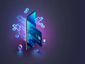
6. Digital Wallet Integration (Apple Pay & Google Pay): Touch-Sensitive Purchases
In the year 2026, typing Visa card numbers will be obsolete. Customers want to pay with Face ID or a touch of their fingerprint via digital wallets. Integrating your store with these services software-wise reduces the customer journey from "3 minutes of data entry" to "3 seconds of fingerprint verification." This is the highest level of click reduction; here, the customer doesn't actually click anything, they simply confirm their identity. Offering this option puts your store on a completely different level in terms of ease of use and professionalism.
7. Instant Confirmation Messages and Quick Review
After clicking "Payment," the user journey doesn't end; it transitions to a "Reassurance" phase. The appearance of a "Thank You for Your Trust" page, along with the order number and estimated delivery time, in just one second builds strong loyalty. A customer who finds their journey "quick, easy, and convenient" is the one who will return to buy from you again without even considering the competition. Simplicity in design is the pinnacle of programming complexity, and that's what we offer at "Sahil."
A user-friendly design makes the customer forget they're "paying money" and focus solely on the "pleasure of the purchase." What do you think is the most common step in your store that makes customers hesitate or get bored?

كيف تبيع لعملائك دون أن ينطق تطبيقك بكلمة واحدة
تطبيقات الـ سوبر آب Super Apps هل هي المستقبل في مصر والسعودية أم مجرد موضة
You can create your store easily