Free support 24/7
Free support 24/7
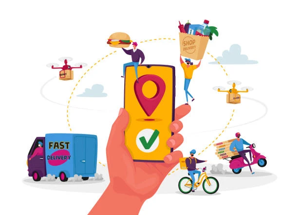
We delve into the psychology of color and the impact of geometric shapes on user behavior in the Saudi and Egyptian markets in 2026. We discuss how to choose a visual identity that accurately reflects your project's message and attracts your target audience, explaining the "Sahil" methodology for integrating color contrast and flowing curves to increase in-app retention rates. This content focuses on transforming your app's interface from mere graphics into a "silent persuasion tool" that fosters brand loyalty and creates a comfortable and motivating user experience, encouraging one-touch purchases with the highest global standards of professionalism.
1. The Psychology of Color and its Impact on Purchase Decisions
At "Sahil," colors are the first message that reaches the customer's mind before they read a single word. Blue evokes a sense of security and trust (which is why most banking apps use it), while orange and red stimulate hunger, speed, and immediate ordering (ideal for restaurant apps). In 2026, you must choose a primary color that reflects your business's personality. If your app is designed for the Saudi market, gold with black or dark green gives an impression of sophistication, making the customer feel they're in a "premium and trustworthy" environment.
2. The 60-30-10 Rule for Color Balance
The biggest mistake we see is "color overload." At "Sahil," we apply a universal geometric rule: 60% primary color (often a calming one like white or light gray), 30% secondary color, and 10% "action" or interaction color. This 10% is where the secret lies; it must be a "sparkling" and completely different color so the customer's eye immediately goes to the "Buy Now" or "Register" button. This balance is easy on the user's eyes and allows them to spend more time in the app without experiencing visual strain.
3. The Psychology of Shapes:
Curves vs. Sharp Corners
Have you ever wondered why most successful app buttons in 2026 have "rounded" corners? At "Sahel," we understand that sharp angles can create a sense of apprehension or excessive formality, while curves convey a feeling of fluidity, ease, and security. Using rounded shapes in icons makes the app appear user-friendly and approachable. This reduces the psychological barriers between the customer and technology, making the app feel effortless and seamless.
4. Color Contrast and Readability ($Contrast$)
At "Sahel," we prioritize customer satisfaction. Strong color contrast between the background and text determines whether a customer continues reading or becomes bored. By 2026, with the widespread adoption of OLED screens, we utilize deep blacks with white text or subtle neon colors in "Night Mode" to conserve battery life and reduce eye strain. If the contrast is weak, the customer will perceive the app as blurry or unprofessional and will seek a clearer, more comfortable alternative.
5. Colors and Local User Experience (Saudi Arabia and Egypt)
Colors have cultural connotations; in Saudi Arabia, green is associated with national identity and growth, while in Egypt, we might use warm colors that reflect vitality and energy. At "Sahil," we always recommend studying the client's "environment." If you're targeting young people, bold, gradient colors are best. If you're targeting business professionals, calm, matte colors convey more sophistication. Choosing the right color makes the client feel that the app was "made for them" and their personal taste.
6. The Impact of 3D Shapes and Visual Depth
In 2026, design will no longer be "flat" and boring. At "Sahil," we use "soft shadows" and shapes with visual depth to make the client feel that the button is "protruding" and actually clickable. This creates a virtual physical interaction that makes the user experience more enjoyable. When customers feel that elements have weight and dimensions, they trust the app's "realism" and technical strength more, transforming their shopping or browsing experience into a visually pleasurable experience that encourages them to return to the app again and again.
7. Color Testing and the Power of A/B Testing: The final secret of "Sahil" is that we don't rely on guesswork. We conduct tests where we change the color of a specific button for a group of users and see who makes the most purchases. Sometimes, changing the color from red to "tomato red" increases sales by 20%! Colors and shapes must evolve over time based on real customer feedback. When customers feel that the app is "changing for the better" and listening to their preferences, they become loyal and consider it part of their daily routine.
Colors are the pulse of design, and shapes are its structure; so make your app a work of art that captivates customers at first glance. What color do you think represents your project, and does it truly convey the right message to your customers in Saudi Arabia and Egypt?
Understanding your customer is the true "code" that powers your project; so make your app a reflection of their aspirations

أخطاء في التصميم بتبعد العملاء عن تطبيقك ابعد عنها فوراً
You can create your store easily